School analytics show how teachers and students across your school are using Flint, what kind of thinking their work asks for, and how they are doing against your standards. Access is based on ownership of the selected term, including inherited school ownership, not just an Admin label. A teacher who created the school can use them too.
Opening school analytics
- Click Admin in the sidebar. It opens the analytics dashboard directly.
- In the admin sidebar, Analytics has three pages: Usage, Alignment and Outcomes. Settings sits below it.
Some retained media shows an earlier interface; follow the written steps for current navigation and chart names.
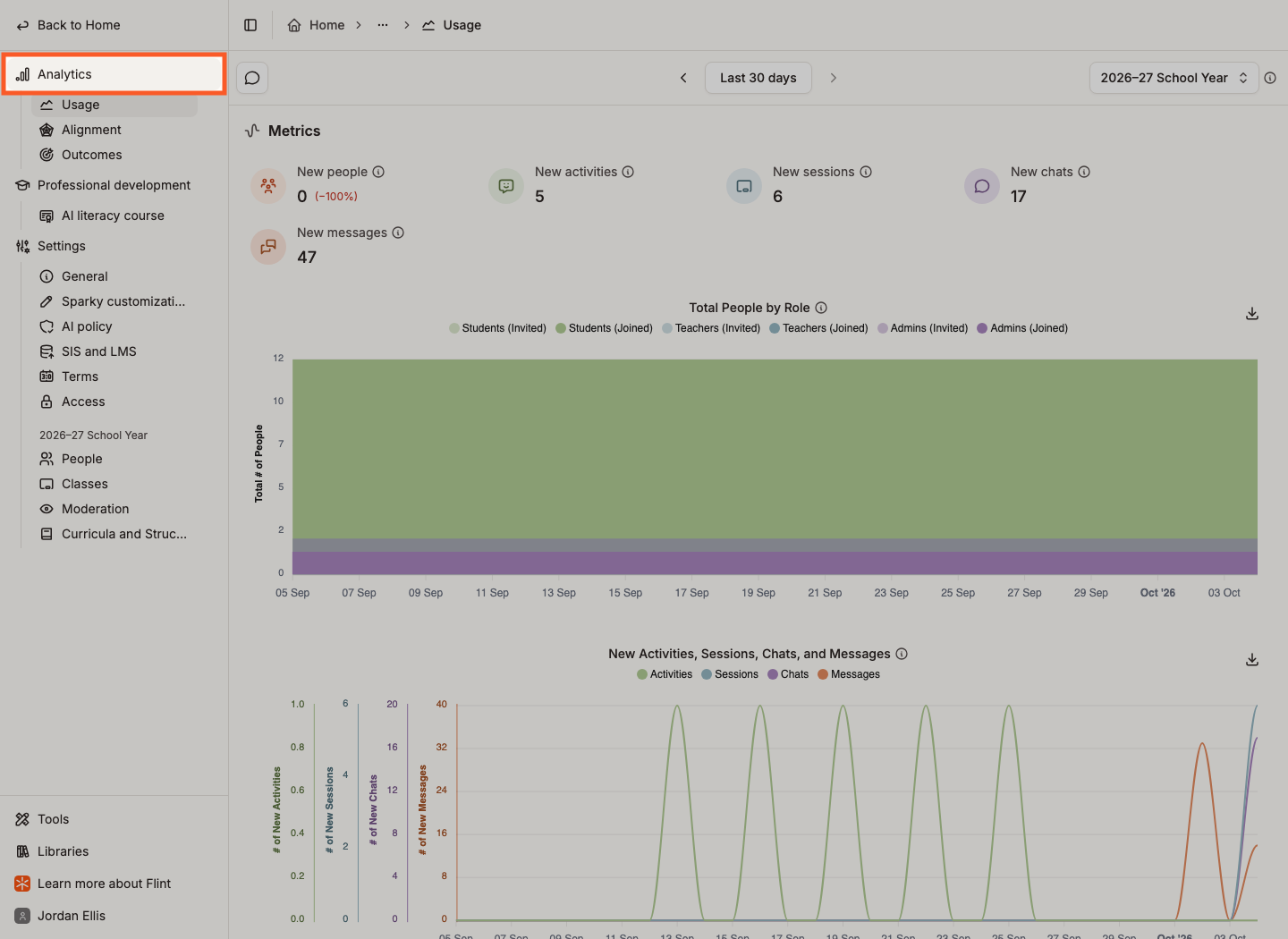
Each page has its own address, so you can bookmark Usage or Alignment and come straight back to it.
The picker on the right of the header chooses which term the numbers cover — "Analytics on this page cover the selected term only." Switch to a past term to see how it went.
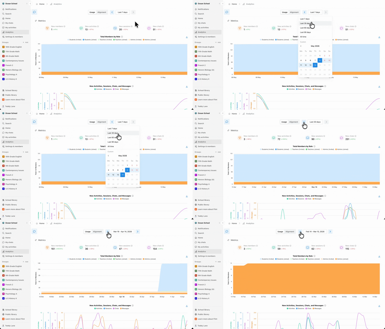
The button in the middle of the header sets the period. Pick Last 7 days, Last 30 days, Last 60 days, Last 90 days or All time, or select the start date and then the end date on the calendar below. The arrows on either side step back and forward by the length of the range you are viewing — from a 30-day view, the left arrow shows the previous 30 days.
The speech-bubble button in the top left opens Ask Sparky about your analytics. Ask a question in plain language and Sparky answers from your school's own numbers. It is available on every analytics page, and Collapse chat closes it again.
You can also ask Sparky to generate a downloadable file from an analysis — for example, "Create a CSV summarising teacher usage for this period." This is a custom file generated in the chat, separate from the dashboards' built-in Download as CSV buttons. Check its contents before sharing it.
Use the Analytics items in the admin sidebar. Usage is how much Flint is being used, Alignment is what the work asks of students and what they demonstrate, and Outcomes is progress against your standards.
What the Usage page shows
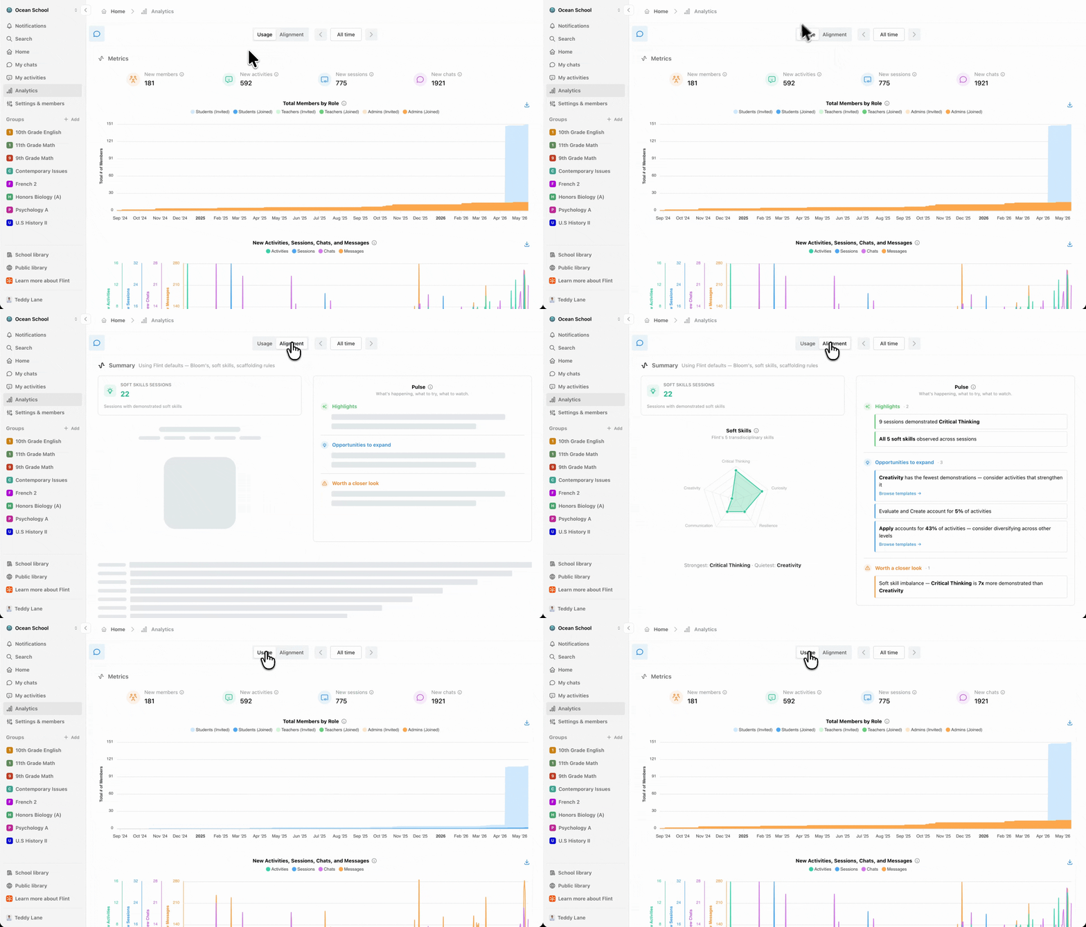
Metrics opens with five counts for the period — New people, New activities, New sessions, New chats and New messages — each with the change against the period before.
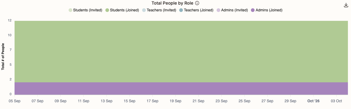
Total People by Role is an area chart of everyone in the school over time, split six ways: Students (Invited), Students (Joined), Teachers (Invited), Teachers (Joined), Admins (Invited) and Admins (Joined). Invited means added to the school; joined means they have signed in at least once. Hover any day for its numbers.
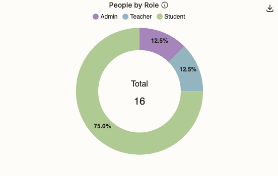
People by Role is a pie of who is in the school right now — Admin, Teacher and Student. It always shows the latest snapshot, whatever date range you picked.
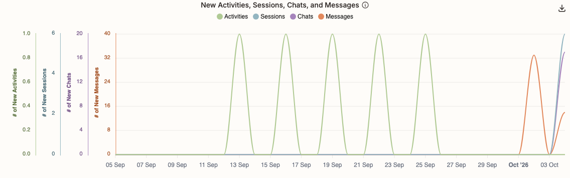
New Activities, Sessions, Chats, and Messages plots daily counts of activities created, sessions started, standalone chats created and messages sent. Drafts are excluded.
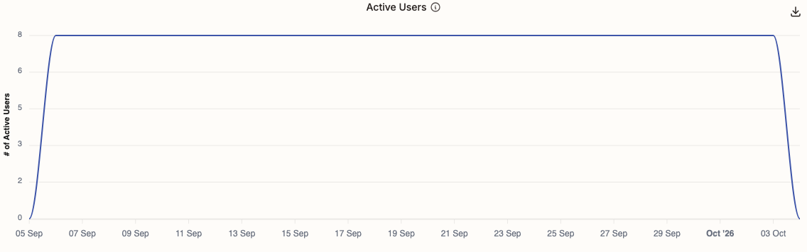
Active Users counts the distinct people who visited each day. It can run up to two hours behind.
If your school has turned off usage analytics, event-based charts such as Active Users, Teacher vs. Student Usage and the Outcomes usage explorer may be empty or incomplete. Waiting for the normal two-hour delay does not resolve an opt-out; these charts differ from counts of created items or submitted work.
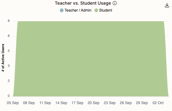
Teacher vs. Student Usage splits those daily active users into Teacher / Admin and Student.
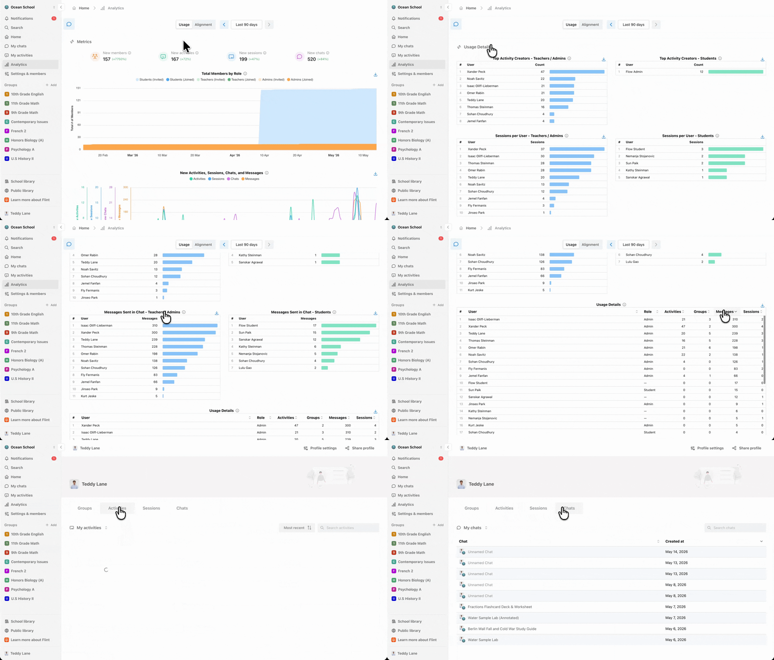
This section breaks the same period down person by person. Every name links to that person's profile.
- Top Activity Creators — two tables, teachers and admins on one side, students on the other
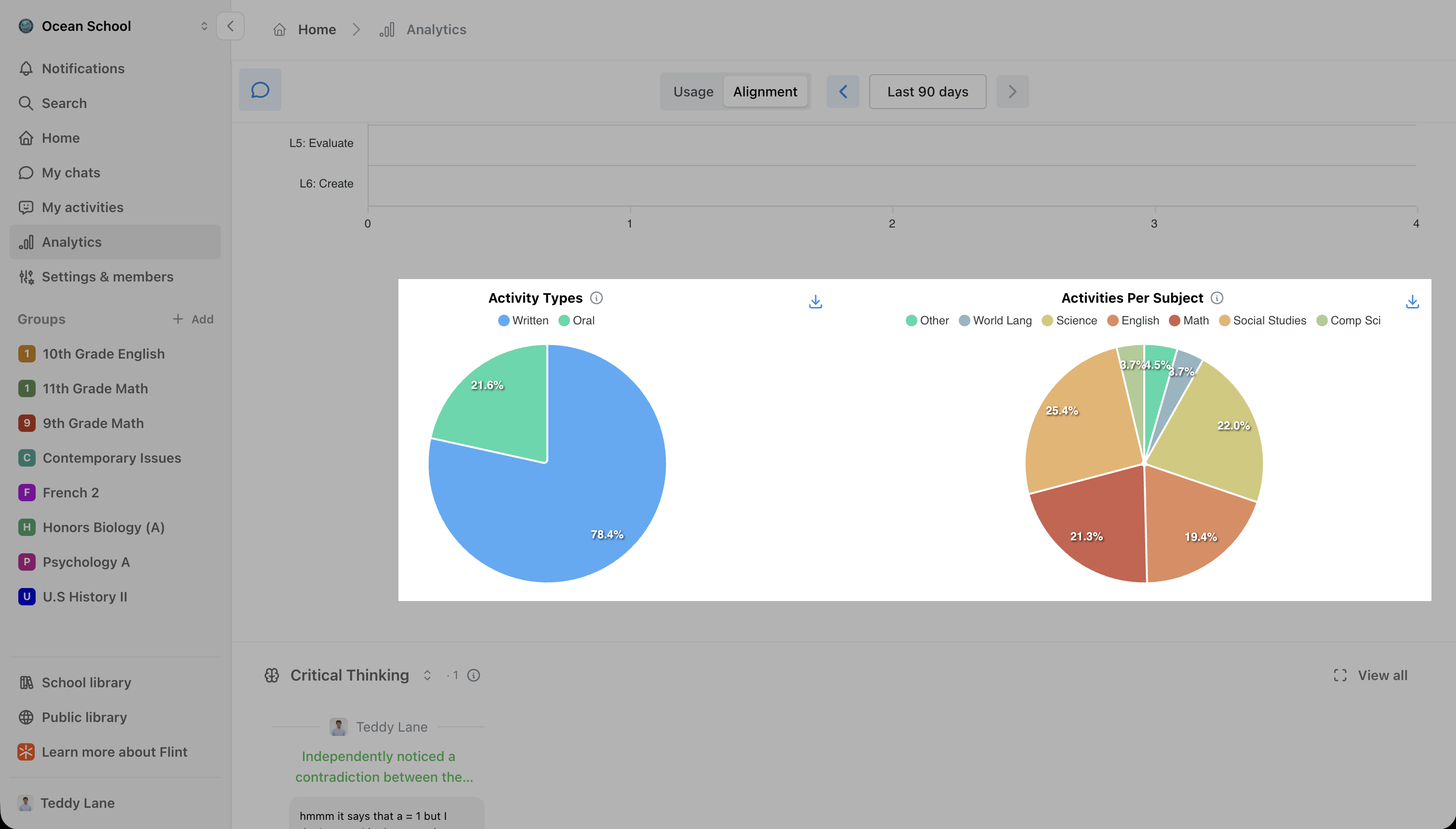
- Activity Types and Activities Per Subject — written versus oral, and the subject mix; click a subject to drill into it
- Top Users by Sessions — the same two tables, ranked by distinct chat sessions they contributed messages to during the period; these are usage counts, not submitted-work totals
- Messages Sent in Chat — the same two tables, ranked by messages sent to Sparky outside an activity
- A sortable table with a row per person: User, Role, Activities, Classes, Messages and Sessions
What the Alignment page shows
Schools on the free plan see this page filled with sample data and an Upgrade now button, so you can see what it looks like before switching it on for real.
Soft Skills Sessions counts the sessions in which students demonstrated one of Flint's five transdisciplinary skills — Critical Thinking, Curiosity, Resilience, Communication and Creativity — and the Soft Skills radar beside it shows which of the five come up most.
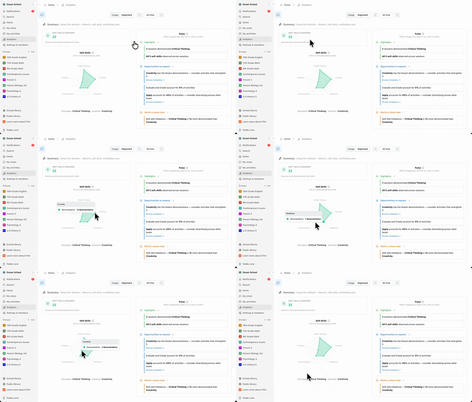
Pulse is Sparky's read on the period, in three groups: Highlights for what is going well, Opportunities to expand for gaps worth filling, and Worth a closer look for patterns to check.
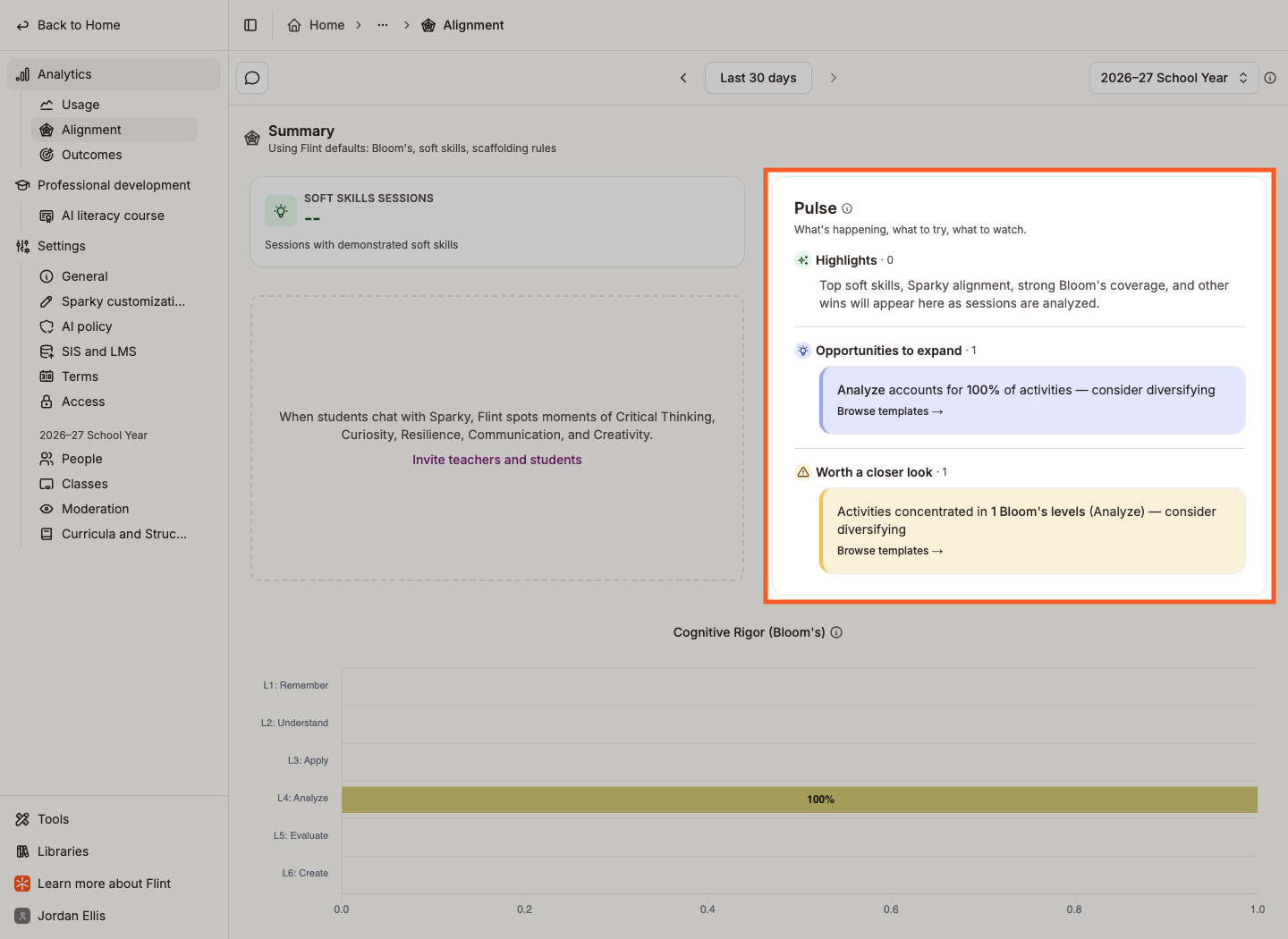
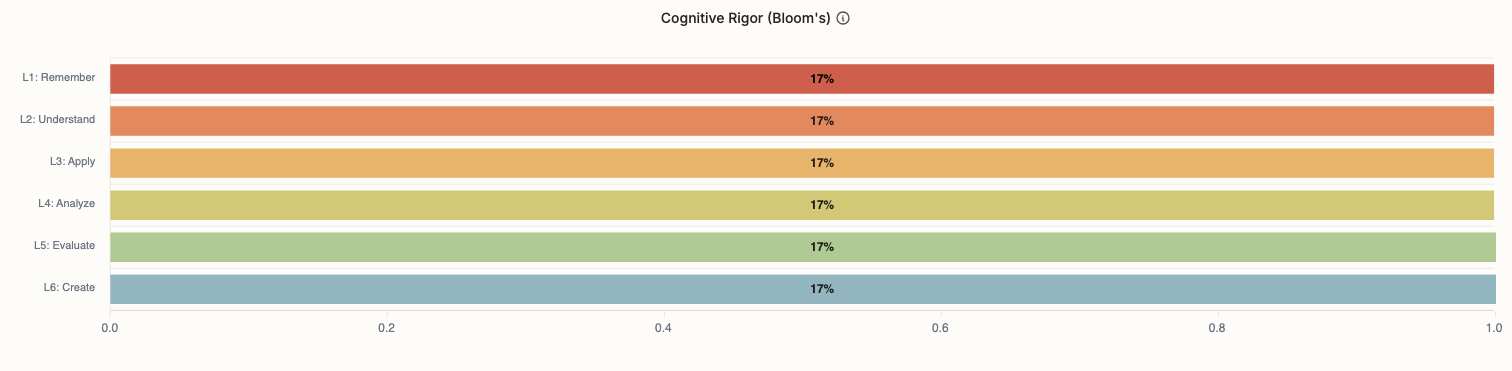
Cognitive Rigor (Bloom's) sorts your activities into the six Bloom's Taxonomy levels, so you can see whether students are being asked for higher-order thinking.
Activity Types and Activities Per Subject close the summary: the written-versus-oral split, and where learning is concentrated.
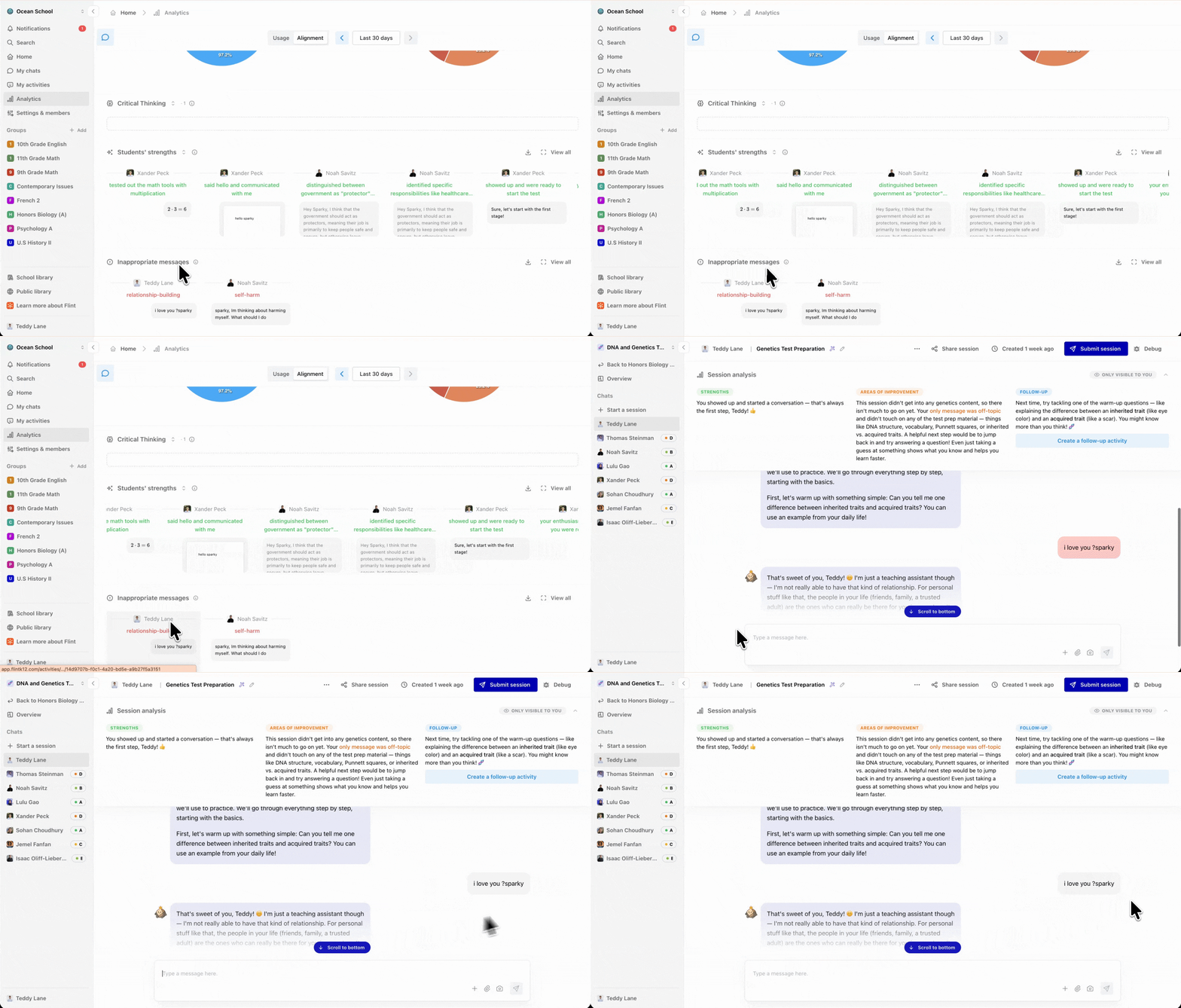
Below the summary sit carousels of real moments, each card linking to the message it came from. View all expands a carousel into a full grid.
Students' Soft Skills shows where a skill was demonstrated, filtered by skill.
The next carousel switches between Students' strengths and Students' areas for improvements, drawn from Sparky's analysis of submitted sessions.
Contextual Alignment shows where Sparky drew on the material you gave it, and Pedagogical Alignment shows the teaching moves it made.
We take student safety seriously. Inappropriate messages collects everything flagged for self-harm, violence or harassment in the period. Each card shows the message, who sent it, when, the categories it matched, and a link to the session it came from.
This article goes into more detail on how moderation works in Flint.
What the Outcomes page shows
Does more Flint mean more learning? compares student outcomes with usage. Switch between By usage and Over time, filter by Subject and Grade, and choose the Outcome and Usage metrics. Available usage metrics include sessions, messages and time spent; in-school and outside-school choices are disabled and marked not tracked. Comparisons show patterns, not proof that usage caused an outcome.
Student outcomes answers what the term did for learning: how many gaps students closed, the share of students Flint worked with individually, and the work Sparky took off teachers' plates — submissions auto-graded, activities matched to standards, and standards set up. By class lists each class with its students, gaps closed and coverage; click a row to open that class's Curriculum tab. Standards Outcomes at the bottom shows individual demonstrations, grouped by how the student engaged the standard.
Three charts show the current state, not the header's selected date range: Where students stand shows mastery tiers, Standards pipeline shows standards moving from approved to covered, assessed and met, and Content coverage shows standards as on target, partial or gaps. Each chart has its own segment or class scope filter.
Until standards are adopted in a class's Curriculum tab, the outcomes summary asks you to adopt standards; other sections have their own empty states.
District analytics
If you own a district, you can view its schools together or focus on a saved school group.
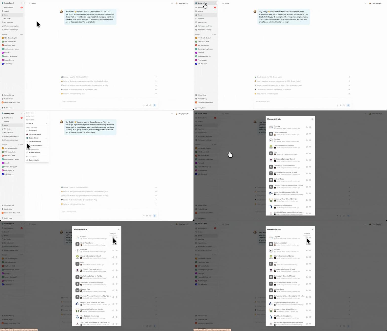
- Click your school's name in the top left corner.
- Click Manage districts.
- Click the chart button next to the district, beside its settings button.
District analytics have Usage and Alignment, plus Usage by School and the Schools table. Outcomes is available at term and class level, not district level.
Use Schools included in analytics to choose All schools or a saved group. The selection persists and scopes district charts and exports. Manage school groups lets you create or edit groups. Select All schools for full-district totals.
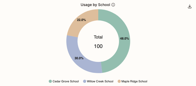
Usage by School compares total usage across the included schools.
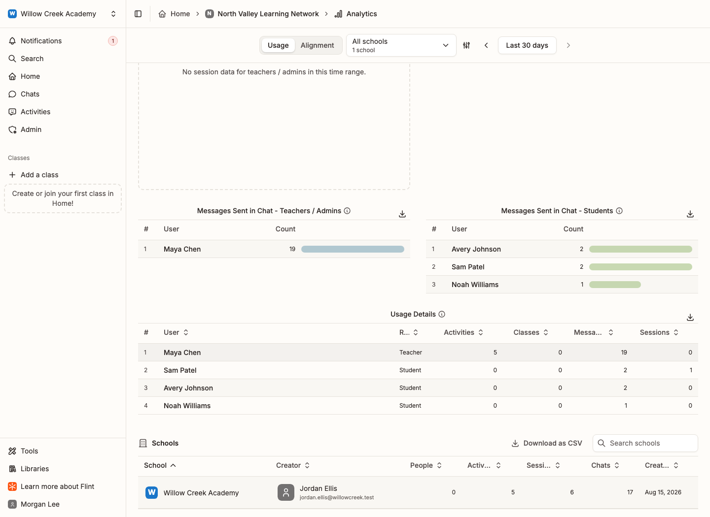
A Schools table at the bottom lists the included schools with their Creator, People, Activities, Sessions, Chats and Created on date, with a search box and its own CSV download.
Exporting to CSV
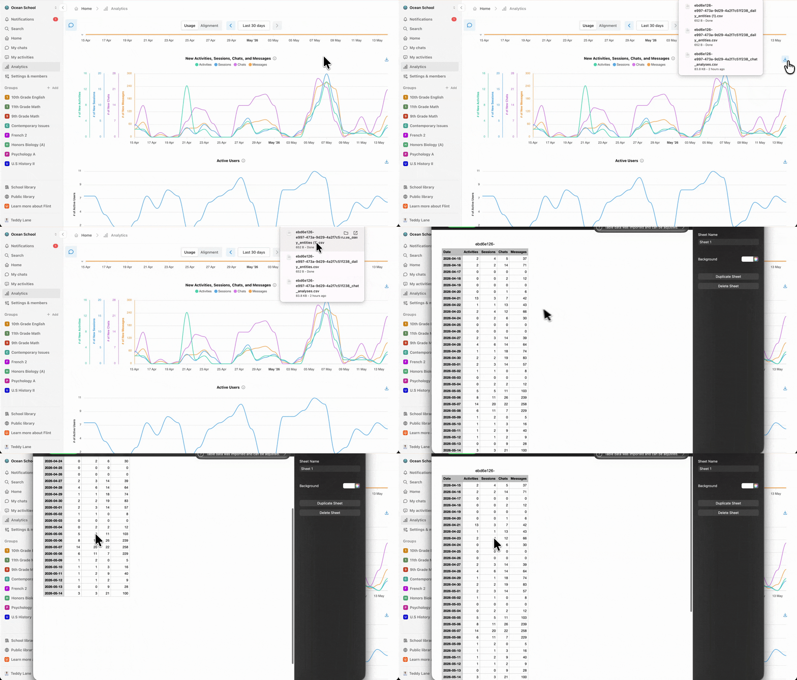
Most charts and tables have a Download as CSV button in their top-right corner. Filenames vary by chart. Most entity-scoped downloads include the entity id, for example <id>_active_users.csv and <id>_people_by_role.csv; Usage by School exports district_events_per_school.csv without a district-id prefix.